
Turning Flavor Into a Visual World.
Creative Direction / Art Direction
Branding
Product Design
Digital Campaign

Strawberry Banana
Turning Flavor Into a Visual World.
PRIME Strawberry Banana launched with a creative identity built directly from the product’s unmistakable flavor combination. Strawberry pink and banana yellow became the foundation for a bold visual system.
Overview
Making the Flavor the World
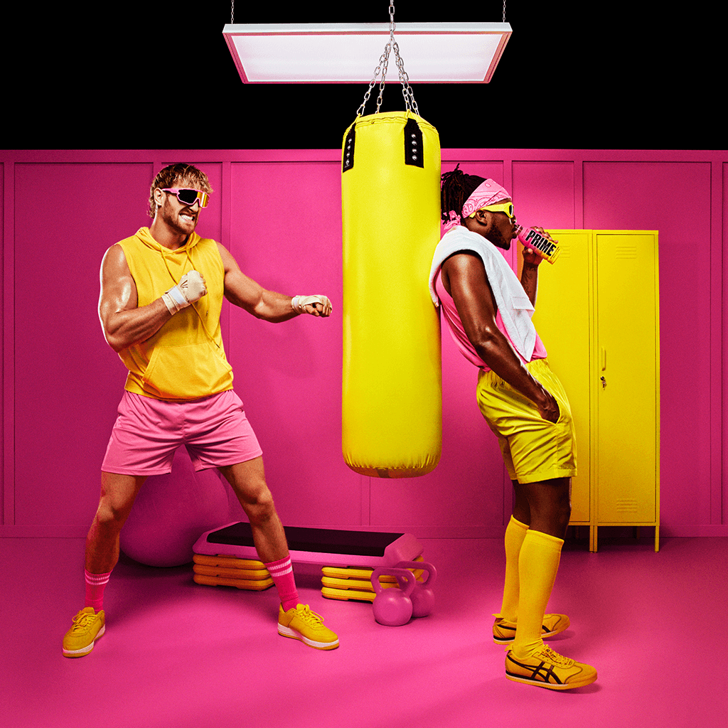
Rather than simply pairing the product with strawberries and bananas, the creative approach amplified the flavor into an entire visual environment. The pink-and-yellow palette became the connective tissue across packaging, wardrobe, set design, props, ingredients, and photography — creating a launch that could move between highly polished product imagery and playful lifestyle storytelling while remaining instantly recognizable.


The Challenge
Making a Familiar Flavor Feel Unexpected Strawberry Banana is an instantly recognizable flavor combination, which created an opportunity — and a challenge — to present it in a way that felt distinctive within the PRIME Hydration lineup. The launch needed to communicate flavor immediately while creating enough personality and visual impact to stand apart across retail, social, digital, and campaign channels.


The solution was to take two familiar flavor cues — strawberry pink and banana yellow — and push them beyond the product itself, turning them into the foundation of an ownable campaign world.
My Role
Creating One Connected Visual System I led the creative direction for the Strawberry Banana launch across packaging, photography, and campaign execution. My role included overseeing the product and multipack visual direction, developing the creative approach for lifestyle and tabletop photography, and guiding the campaign from concept through final execution.


Across each touchpoint, the focus was on maintaining one cohesive idea. The bottle established the color language, lifestyle photography expanded it into an exaggerated fitness environment, and tabletop imagery translated it into product-focused compositions using fruit, water, ice, and unexpected graphic elements.

The Results
One Idea, Expressed Across Every Touchpoint The final campaign transformed a simple flavor combination into a distinctive visual identity for Strawberry Banana within the PRIME portfolio. A consistent pink-and-yellow system connected the bottle, retail packaging, photography, and campaign assets while still allowing each execution to have its own personality. By building the creative around a single recognizable idea—making the flavor the world—the launch created a flexible campaign system that could shift from product-first communication to larger lifestyle storytelling without losing brand or flavor recognition.
Strawberry Banana
Credits
Congo Creative Studio
Previous Project
Next Project


Turning Flavor Into a Visual World.
Creative Direction / Art Direction
Branding
Product Design
Digital Campaign
Strawberry Banana
Turning Flavor Into a Visual World.
PRIME Strawberry Banana launched with a creative identity built directly from the product’s unmistakable flavor combination. Strawberry pink and banana yellow became the foundation for a bold visual system.
Overview
Making the Flavor the World
Rather than simply pairing the product with strawberries and bananas, the creative approach amplified the flavor into an entire visual environment. The pink-and-yellow palette became the connective tissue across packaging, wardrobe, set design, props, ingredients, and photography — creating a launch that could move between highly polished product imagery and playful lifestyle storytelling while remaining instantly recognizable.
The Challenge
Making a Familiar Flavor Feel Unexpected Strawberry Banana is an instantly recognizable flavor combination, which created an opportunity — and a challenge — to present it in a way that felt distinctive within the PRIME Hydration lineup. The launch needed to communicate flavor immediately while creating enough personality and visual impact to stand apart across retail, social, digital, and campaign channels.
The solution was to take two familiar flavor cues — strawberry pink and banana yellow — and push them beyond the product itself, turning them into the foundation of an ownable campaign world.
My Role
Creating One Connected Visual System I led the creative direction for the Strawberry Banana launch across packaging, photography, and campaign execution. My role included overseeing the product and multipack visual direction, developing the creative approach for lifestyle and tabletop photography, and guiding the campaign from concept through final execution.
Across each touchpoint, the focus was on maintaining one cohesive idea. The bottle established the color language, lifestyle photography expanded it into an exaggerated fitness environment, and tabletop imagery translated it into product-focused compositions using fruit, water, ice, and unexpected graphic elements.
The Results
One Idea, Expressed Across Every Touchpoint The final campaign transformed a simple flavor combination into a distinctive visual identity for Strawberry Banana within the PRIME portfolio. A consistent pink-and-yellow system connected the bottle, retail packaging, photography, and campaign assets while still allowing each execution to have its own personality. By building the creative around a single recognizable idea—making the flavor the world—the launch created a flexible campaign system that could shift from product-first communication to larger lifestyle storytelling without losing brand or flavor recognition.
Strawberry Banana
Credits
Congo Creative Studio
Previous Project
Next Project
Turning Flavor Into a Visual World.
Creative Direction / Art Direction
Branding
Product Design
Digital Campaign
Strawberry Banana
Turning Flavor Into a Visual World.
PRIME Strawberry Banana launched with a creative identity built directly from the product’s unmistakable flavor combination. Strawberry pink and banana yellow became the foundation for a bold visual system.
Overview
Making the Flavor the World
Rather than simply pairing the product with strawberries and bananas, the creative approach amplified the flavor into an entire visual environment. The pink-and-yellow palette became the connective tissue across packaging, wardrobe, set design, props, ingredients, and photography — creating a launch that could move between highly polished product imagery and playful lifestyle storytelling while remaining instantly recognizable.
The Challenge
Making a Familiar Flavor Feel Unexpected Strawberry Banana is an instantly recognizable flavor combination, which created an opportunity — and a challenge — to present it in a way that felt distinctive within the PRIME Hydration lineup. The launch needed to communicate flavor immediately while creating enough personality and visual impact to stand apart across retail, social, digital, and campaign channels.
The solution was to take two familiar flavor cues — strawberry pink and banana yellow — and push them beyond the product itself, turning them into the foundation of an ownable campaign world.
My Role
Creating One Connected Visual System I led the creative direction for the Strawberry Banana launch across packaging, photography, and campaign execution. My role included overseeing the product and multipack visual direction, developing the creative approach for lifestyle and tabletop photography, and guiding the campaign from concept through final execution.
Across each touchpoint, the focus was on maintaining one cohesive idea. The bottle established the color language, lifestyle photography expanded it into an exaggerated fitness environment, and tabletop imagery translated it into product-focused compositions using fruit, water, ice, and unexpected graphic elements.
The Results
One Idea, Expressed Across Every Touchpoint The final campaign transformed a simple flavor combination into a distinctive visual identity for Strawberry Banana within the PRIME portfolio. A consistent pink-and-yellow system connected the bottle, retail packaging, photography, and campaign assets while still allowing each execution to have its own personality. By building the creative around a single recognizable idea—making the flavor the world—the launch created a flexible campaign system that could shift from product-first communication to larger lifestyle storytelling without losing brand or flavor recognition.
Strawberry Banana
Credits
Congo Creative Studio
Previous Project

Next Project
Turning Flavor Into a Visual World.
Creative Direction / Art Direction
Branding
Product Design
Digital Campaign
Strawberry Banana
Turning Flavor Into a Visual World.
PRIME Strawberry Banana launched with a creative identity built directly from the product’s unmistakable flavor combination. Strawberry pink and banana yellow became the foundation for a bold visual system.
Overview
Making the Flavor the World
Rather than simply pairing the product with strawberries and bananas, the creative approach amplified the flavor into an entire visual environment. The pink-and-yellow palette became the connective tissue across packaging, wardrobe, set design, props, ingredients, and photography — creating a launch that could move between highly polished product imagery and playful lifestyle storytelling while remaining instantly recognizable.
The Challenge
Making a Familiar Flavor Feel Unexpected Strawberry Banana is an instantly recognizable flavor combination, which created an opportunity — and a challenge — to present it in a way that felt distinctive within the PRIME Hydration lineup. The launch needed to communicate flavor immediately while creating enough personality and visual impact to stand apart across retail, social, digital, and campaign channels.
The solution was to take two familiar flavor cues — strawberry pink and banana yellow — and push them beyond the product itself, turning them into the foundation of an ownable campaign world.
My Role
Creating One Connected Visual System I led the creative direction for the Strawberry Banana launch across packaging, photography, and campaign execution. My role included overseeing the product and multipack visual direction, developing the creative approach for lifestyle and tabletop photography, and guiding the campaign from concept through final execution.
Across each touchpoint, the focus was on maintaining one cohesive idea. The bottle established the color language, lifestyle photography expanded it into an exaggerated fitness environment, and tabletop imagery translated it into product-focused compositions using fruit, water, ice, and unexpected graphic elements.
The Results
One Idea, Expressed Across Every Touchpoint The final campaign transformed a simple flavor combination into a distinctive visual identity for Strawberry Banana within the PRIME portfolio. A consistent pink-and-yellow system connected the bottle, retail packaging, photography, and campaign assets while still allowing each execution to have its own personality. By building the creative around a single recognizable idea—making the flavor the world—the launch created a flexible campaign system that could shift from product-first communication to larger lifestyle storytelling without losing brand or flavor recognition.
Strawberry Banana
Credits
Congo Creative Studio
Previous Project
Next Project
Turning Flavor Into a Visual World.
Creative Direction / Art Direction
Branding
Product Design
Digital Campaign
Strawberry Banana
Turning Flavor Into a Visual World.
PRIME Strawberry Banana launched with a creative identity built directly from the product’s unmistakable flavor combination. Strawberry pink and banana yellow became the foundation for a bold visual system.
Overview
Making the Flavor the World
Rather than simply pairing the product with strawberries and bananas, the creative approach amplified the flavor into an entire visual environment. The pink-and-yellow palette became the connective tissue across packaging, wardrobe, set design, props, ingredients, and photography — creating a launch that could move between highly polished product imagery and playful lifestyle storytelling while remaining instantly recognizable.
The Challenge
Making a Familiar Flavor Feel Unexpected Strawberry Banana is an instantly recognizable flavor combination, which created an opportunity — and a challenge — to present it in a way that felt distinctive within the PRIME Hydration lineup. The launch needed to communicate flavor immediately while creating enough personality and visual impact to stand apart across retail, social, digital, and campaign channels.
The solution was to take two familiar flavor cues — strawberry pink and banana yellow — and push them beyond the product itself, turning them into the foundation of an ownable campaign world.
My Role
Creating One Connected Visual System I led the creative direction for the Strawberry Banana launch across packaging, photography, and campaign execution. My role included overseeing the product and multipack visual direction, developing the creative approach for lifestyle and tabletop photography, and guiding the campaign from concept through final execution.
Across each touchpoint, the focus was on maintaining one cohesive idea. The bottle established the color language, lifestyle photography expanded it into an exaggerated fitness environment, and tabletop imagery translated it into product-focused compositions using fruit, water, ice, and unexpected graphic elements.
The Results
One Idea, Expressed Across Every Touchpoint The final campaign transformed a simple flavor combination into a distinctive visual identity for Strawberry Banana within the PRIME portfolio. A consistent pink-and-yellow system connected the bottle, retail packaging, photography, and campaign assets while still allowing each execution to have its own personality. By building the creative around a single recognizable idea—making the flavor the world—the launch created a flexible campaign system that could shift from product-first communication to larger lifestyle storytelling without losing brand or flavor recognition.
Strawberry Banana
Credits
Congo Creative Studio
Previous Project
Next Project
Turning Flavor Into a Visual World.
Creative Direction / Art Direction
Branding
Product Design
Digital Campaign
Strawberry Banana
Turning Flavor Into a Visual World.
PRIME Strawberry Banana launched with a creative identity built directly from the product’s unmistakable flavor combination. Strawberry pink and banana yellow became the foundation for a bold visual system.
Overview
Making the Flavor the World
Rather than simply pairing the product with strawberries and bananas, the creative approach amplified the flavor into an entire visual environment. The pink-and-yellow palette became the connective tissue across packaging, wardrobe, set design, props, ingredients, and photography — creating a launch that could move between highly polished product imagery and playful lifestyle storytelling while remaining instantly recognizable.
The Challenge
Making a Familiar Flavor Feel Unexpected Strawberry Banana is an instantly recognizable flavor combination, which created an opportunity — and a challenge — to present it in a way that felt distinctive within the PRIME Hydration lineup. The launch needed to communicate flavor immediately while creating enough personality and visual impact to stand apart across retail, social, digital, and campaign channels.
The solution was to take two familiar flavor cues — strawberry pink and banana yellow — and push them beyond the product itself, turning them into the foundation of an ownable campaign world.
My Role
Creating One Connected Visual System I led the creative direction for the Strawberry Banana launch across packaging, photography, and campaign execution. My role included overseeing the product and multipack visual direction, developing the creative approach for lifestyle and tabletop photography, and guiding the campaign from concept through final execution.
Across each touchpoint, the focus was on maintaining one cohesive idea. The bottle established the color language, lifestyle photography expanded it into an exaggerated fitness environment, and tabletop imagery translated it into product-focused compositions using fruit, water, ice, and unexpected graphic elements.
The Results
One Idea, Expressed Across Every Touchpoint The final campaign transformed a simple flavor combination into a distinctive visual identity for Strawberry Banana within the PRIME portfolio. A consistent pink-and-yellow system connected the bottle, retail packaging, photography, and campaign assets while still allowing each execution to have its own personality. By building the creative around a single recognizable idea—making the flavor the world—the launch created a flexible campaign system that could shift from product-first communication to larger lifestyle storytelling without losing brand or flavor recognition.
Strawberry Banana
Credits
Congo Creative Studio
Previous Project
Next Project
Turning Flavor Into a Visual World.
Creative Direction / Art Direction
Branding
Product Design
Digital Campaign
Strawberry Banana
Turning Flavor Into a Visual World.
PRIME Strawberry Banana launched with a creative identity built directly from the product’s unmistakable flavor combination. Strawberry pink and banana yellow became the foundation for a bold visual system.
Overview
Making the Flavor the World
Rather than simply pairing the product with strawberries and bananas, the creative approach amplified the flavor into an entire visual environment. The pink-and-yellow palette became the connective tissue across packaging, wardrobe, set design, props, ingredients, and photography — creating a launch that could move between highly polished product imagery and playful lifestyle storytelling while remaining instantly recognizable.
The Challenge
Making a Familiar Flavor Feel Unexpected Strawberry Banana is an instantly recognizable flavor combination, which created an opportunity — and a challenge — to present it in a way that felt distinctive within the PRIME Hydration lineup. The launch needed to communicate flavor immediately while creating enough personality and visual impact to stand apart across retail, social, digital, and campaign channels.
The solution was to take two familiar flavor cues — strawberry pink and banana yellow — and push them beyond the product itself, turning them into the foundation of an ownable campaign world.
My Role
Creating One Connected Visual System I led the creative direction for the Strawberry Banana launch across packaging, photography, and campaign execution. My role included overseeing the product and multipack visual direction, developing the creative approach for lifestyle and tabletop photography, and guiding the campaign from concept through final execution.
Across each touchpoint, the focus was on maintaining one cohesive idea. The bottle established the color language, lifestyle photography expanded it into an exaggerated fitness environment, and tabletop imagery translated it into product-focused compositions using fruit, water, ice, and unexpected graphic elements.
The Results
One Idea, Expressed Across Every Touchpoint The final campaign transformed a simple flavor combination into a distinctive visual identity for Strawberry Banana within the PRIME portfolio. A consistent pink-and-yellow system connected the bottle, retail packaging, photography, and campaign assets while still allowing each execution to have its own personality. By building the creative around a single recognizable idea—making the flavor the world—the launch created a flexible campaign system that could shift from product-first communication to larger lifestyle storytelling without losing brand or flavor recognition.
Strawberry Banana
Credits
Congo Creative Studio
Previous Project
Next Project
Turning Flavor Into a Visual World.
Creative Direction / Art Direction
Branding
Product Design
Digital Campaign
Strawberry Banana
Turning Flavor Into a Visual World.
PRIME Strawberry Banana launched with a creative identity built directly from the product’s unmistakable flavor combination. Strawberry pink and banana yellow became the foundation for a bold visual system.
Overview
Making the Flavor the World
Rather than simply pairing the product with strawberries and bananas, the creative approach amplified the flavor into an entire visual environment. The pink-and-yellow palette became the connective tissue across packaging, wardrobe, set design, props, ingredients, and photography — creating a launch that could move between highly polished product imagery and playful lifestyle storytelling while remaining instantly recognizable.
The Challenge
Making a Familiar Flavor Feel Unexpected Strawberry Banana is an instantly recognizable flavor combination, which created an opportunity — and a challenge — to present it in a way that felt distinctive within the PRIME Hydration lineup. The launch needed to communicate flavor immediately while creating enough personality and visual impact to stand apart across retail, social, digital, and campaign channels.
The solution was to take two familiar flavor cues — strawberry pink and banana yellow — and push them beyond the product itself, turning them into the foundation of an ownable campaign world.
My Role
Creating One Connected Visual System I led the creative direction for the Strawberry Banana launch across packaging, photography, and campaign execution. My role included overseeing the product and multipack visual direction, developing the creative approach for lifestyle and tabletop photography, and guiding the campaign from concept through final execution.
Across each touchpoint, the focus was on maintaining one cohesive idea. The bottle established the color language, lifestyle photography expanded it into an exaggerated fitness environment, and tabletop imagery translated it into product-focused compositions using fruit, water, ice, and unexpected graphic elements.
The Results
One Idea, Expressed Across Every Touchpoint The final campaign transformed a simple flavor combination into a distinctive visual identity for Strawberry Banana within the PRIME portfolio. A consistent pink-and-yellow system connected the bottle, retail packaging, photography, and campaign assets while still allowing each execution to have its own personality. By building the creative around a single recognizable idea—making the flavor the world—the launch created a flexible campaign system that could shift from product-first communication to larger lifestyle storytelling without losing brand or flavor recognition.
Strawberry Banana
Credits
Congo Creative Studio
Previous Project
Next Project
Turning Flavor Into a Visual World.
Creative Direction / Art Direction
Branding
Product Design
Digital Campaign
Strawberry Banana
Turning Flavor Into a Visual World.
PRIME Strawberry Banana launched with a creative identity built directly from the product’s unmistakable flavor combination. Strawberry pink and banana yellow became the foundation for a bold visual system.
Overview
Making the Flavor the World
Rather than simply pairing the product with strawberries and bananas, the creative approach amplified the flavor into an entire visual environment. The pink-and-yellow palette became the connective tissue across packaging, wardrobe, set design, props, ingredients, and photography — creating a launch that could move between highly polished product imagery and playful lifestyle storytelling while remaining instantly recognizable.
The Challenge
Making a Familiar Flavor Feel Unexpected Strawberry Banana is an instantly recognizable flavor combination, which created an opportunity — and a challenge — to present it in a way that felt distinctive within the PRIME Hydration lineup. The launch needed to communicate flavor immediately while creating enough personality and visual impact to stand apart across retail, social, digital, and campaign channels.
The solution was to take two familiar flavor cues — strawberry pink and banana yellow — and push them beyond the product itself, turning them into the foundation of an ownable campaign world.
My Role
Creating One Connected Visual System I led the creative direction for the Strawberry Banana launch across packaging, photography, and campaign execution. My role included overseeing the product and multipack visual direction, developing the creative approach for lifestyle and tabletop photography, and guiding the campaign from concept through final execution.
Across each touchpoint, the focus was on maintaining one cohesive idea. The bottle established the color language, lifestyle photography expanded it into an exaggerated fitness environment, and tabletop imagery translated it into product-focused compositions using fruit, water, ice, and unexpected graphic elements.
The Results
One Idea, Expressed Across Every Touchpoint The final campaign transformed a simple flavor combination into a distinctive visual identity for Strawberry Banana within the PRIME portfolio. A consistent pink-and-yellow system connected the bottle, retail packaging, photography, and campaign assets while still allowing each execution to have its own personality. By building the creative around a single recognizable idea—making the flavor the world—the launch created a flexible campaign system that could shift from product-first communication to larger lifestyle storytelling without losing brand or flavor recognition.
Strawberry Banana
Credits
Congo Creative Studio
Previous Project
Next Project